Licensed, Bonded & Insured
Palm Beach U-21244
Broward 09-P-15607-R


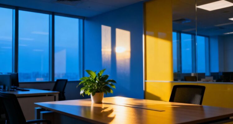
We’ve all been in offices that just feel… off. Maybe it’s a place that makes you feel sleepy, or another that feels too busy. Often, the colors on the walls play a big part in how we feel and work. Our article looks at how choosing the right colors for office painting can really change things. We’ll talk about how different shades can affect our mood and our ability to get things done. It’s more than just picking a pretty color; it’s about making the space work for us.
We’ve all been in offices that just feel… off. Maybe it’s a bit too drab, or perhaps it’s a jarring shade that makes us feel on edge. The colors we surround ourselves with at work actually play a pretty big role in how we feel and, consequently, how much we get done. It’s not just about making the place look nice; it’s about using color science to make our work lives better.
When we think about colors that help us focus and stay calm, blue and green often come to mind. Blue, for instance, is known for its ability to lower heart rates and blood pressure. This can lead to a more serene atmosphere, which is great for tasks requiring concentration. Think about accounting departments or places where detailed analysis happens – a soft blue can really help.
Green, on the other hand, is linked to nature and balance. It’s a color that’s easy on the eyes and can reduce eye strain, a common issue for those spending hours in front of a screen. It also promotes a sense of well-being and can make people feel more relaxed and less stressed. This makes it a good choice for general office areas or even break rooms.
Here’s a quick look at how these colors can impact us:
While blues and greens are good for focus, sometimes we need a different vibe, especially for teams that thrive on brainstorming and interaction. This is where warmer colors can step in. Colors like yellow and orange, when used thoughtfully, can spark energy and encourage creative thinking.
Yellow, in particular, is often associated with optimism and happiness. A touch of yellow can make a space feel more cheerful and inviting, which can be beneficial for collaborative zones or meeting rooms where ideas need to flow freely. However, too much bright yellow can be overwhelming, so it’s best used as an accent.
Orange is another energetic color. It’s known for stimulating enthusiasm and creativity. It can make people feel more social and willing to engage, making it a good choice for common areas or spaces where team members often interact. Like yellow, moderation is key to avoid overstimulation.
We need to be careful not to just slap any color on the wall and expect miracles. The shade, the amount, and where it’s placed all matter. A pale, muted yellow is very different from a bright, neon one. Similarly, a deep forest green will have a different effect than a lime green.
Using these colors strategically can make a real difference in how productive and engaged our teams feel. It’s about creating an environment that supports the kind of work we need to do.
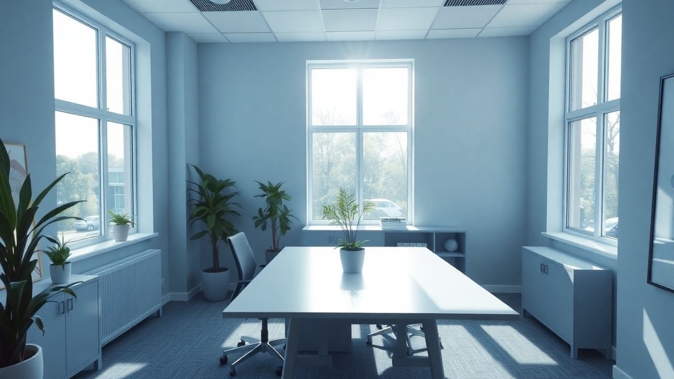
Sometimes, the hustle and bustle of the workday can feel a bit much, right? We’ve found that the colors we surround ourselves with play a big part in how we feel and how well we can concentrate. It’s not just about making the office look nice; it’s about making it a place where we can actually get things done without feeling overwhelmed. Choosing the right paint colors can significantly impact our ability to stay calm and focused.
We often overlook the power of neutral and earth-toned colors, but they can be incredibly effective in creating a peaceful atmosphere. Think about soft grays, warm beiges, and muted creams. These shades don’t demand a lot of attention, which is exactly what we want when we need to concentrate. They provide a stable backdrop that allows our minds to settle. We’ve noticed that in areas painted with these colors, people tend to report feeling less stressed and more able to stick with their tasks.
Here’s a quick look at how some common neutrals can affect us:
| Color | Effect on Mood |
|---|---|
| Soft Gray | Calming, stable |
| Warm Beige | Grounding, comforting |
| Muted Cream | Peaceful, airy |
| Light Brown | Natural, relaxed |
Beyond just creating a calm space, we also need to think about what might pull our attention away from our work. Bright, overly stimulating colors, while sometimes good for energy, can be a real problem when focus is the goal. We’ve learned that it’s better to use these bolder colors sparingly, perhaps as accents, rather than painting entire walls. The key is balance. We want an environment that supports deep work, not one that constantly vies for our attention.
When selecting colors for focus, consider these points:
We’ve found that a workspace that feels visually quiet allows our brains to quiet down too. It’s like decluttering your desk, but for your eyes. This mental quiet is what lets us really get into the zone and do our best work without constant interruptions from our surroundings.
Ultimately, the goal is to create a workspace that feels like a sanctuary for productivity. By being mindful of our color choices, we can make a real difference in how we feel and perform throughout the day.
So, we’ve looked at how colors can really change how we feel at work. It’s not just about making things look pretty; it’s about how blues might calm us down or how yellows could make us feel more alert. We’ve seen that picking the right shades for walls, furniture, or even just small decorations can make a difference in how productive and happy people are. It’s a simple idea, really, but one that can have a big effect. We think it’s worth paying attention to these color choices when setting up or changing an office space. It’s a small step that might lead to a better work environment for everyone.
We can pick colors that help focus and get more done. For example, blues and greens are known to be calming and can help people concentrate. Using these colors in work areas might make our teams more productive. We should think about which colors best suit the tasks we need to accomplish.
To create a peaceful work setting, we often look to neutral colors like beige, gray, or white. Earthy tones, such as soft browns and muted greens, also bring a sense of calm. These shades can help reduce stress and make the office feel more welcoming and less overwhelming for everyone.
Yes, we should be careful with very bright or jarring colors, like neon yellow or intense red, as they can be distracting. While they might seem exciting, they can pull attention away from important tasks. It’s better to use these sparingly or not at all in main work areas to keep focus.

Leave a Comment