Licensed, Bonded & Insured
Palm Beach U-21244
Broward 09-P-15607-R


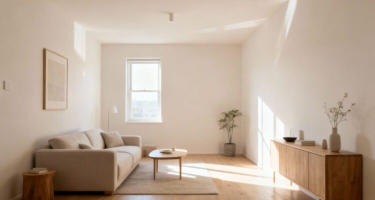
We’re looking at ways to make our homes feel a bit more open, especially when square footage is tight. Paint is a simple tool, but it can make a big difference. We’ll go over some interior painting tips to help you get that spacious feel without knocking down any walls.
When we’re looking to make a small room feel more spacious, the colors we pick play a huge role. It’s not just about slapping some paint on the walls; it’s about using color strategically. We want to trick the eye, making the space feel open and airy.
This is probably the most common advice, and for good reason. Light colors reflect more light, making walls seem to recede. Think soft whites, pale grays, muted blues, and gentle greens. These shades create a sense of openness.
We’ve found that using a very light, almost off-white color on all surfaces, including trim and even the ceiling, can make the boundaries of the room blur. This continuity helps the space feel much larger than it is.
A monochromatic color scheme uses variations of a single color. This means using different shades, tints, and tones of one hue. It creates a very cohesive and uncluttered look, which is fantastic for small spaces. When everything flows together, there are fewer visual breaks, and the eye can move around the room more freely.
Here’s how we approach it:
The key is to keep the overall feel light and consistent. Avoid high contrast, as that can chop up the space visually. A well-executed monochromatic scheme feels sophisticated and makes the room feel like one continuous, flowing area.
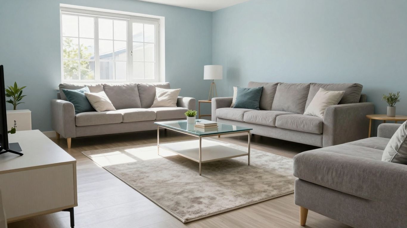
Choosing the right colors is only half the battle when we’re trying to make a small space feel larger. How we actually apply that paint makes a huge difference. We need to think about where we’re putting the color, not just what color we’re using. It’s about tricking the eye, making the room seem more expansive than it is.
We often forget about the ceiling, don’t we? It’s just this big white expanse above us. But painting it can really change how a room feels. If we paint the ceiling a lighter shade than the walls, it can make the walls seem taller. Think of it like pushing the ceiling up. This is especially effective in rooms with lower ceilings. We can even go a step further and paint the ceiling the same light color as the walls. This blurs the line between wall and ceiling, making the whole space feel more open and continuous. It’s a simple trick, but it works wonders.
Accent walls can be tricky in small spaces. We don’t want to chop up the room or make it feel smaller. But used correctly, they can actually help. The idea is to draw attention to a specific feature or create a sense of depth. For instance, painting the wall at the far end of a narrow room a slightly darker or bolder color can make that wall seem closer, visually shortening the room and making it feel more balanced. It’s about guiding the eye. We should avoid painting the longest walls an accent color, as this can make the room feel even more cramped.
We need to be mindful of how an accent wall can affect the perceived dimensions of a room. The goal is to create interest without sacrificing the feeling of spaciousness.
Here’s a quick guide on where to place an accent wall:
We have to be careful not to overdo it. One well-placed accent wall is usually enough. Too many can make a small room feel busy and closed in. It’s all about strategic placement and choosing a color that complements, rather than overwhelms, the rest of the room’s palette.
So, we’ve gone over how paint can really change how a small room feels. It’s not just about picking a color; it’s about how that color works with light and the space you have. We’ve seen how lighter shades can open things up and how using paint strategically, like on ceilings or with accent walls, can trick the eye. It’s pretty amazing what a few coats of paint can do without needing to knock down any walls. Give these ideas a try in your own home, and you might be surprised at the difference it makes. Happy painting!
We find that using light and bright colors is our go-to trick. Think soft whites, pale grays, or gentle blues. These shades bounce light around the room, making it feel more open and airy. Staying within a similar color family, like using different shades of the same color, also helps create a smooth, continuous look that tricks the eye into seeing more space.
Painting the ceiling a lighter color than the walls, or even the same light color as the walls, is a fantastic way to make the room feel taller. It draws the eye upward, giving the impression of more height. We often suggest a crisp white or a very pale version of the wall color for this effect.
Yes, they can be, but we need to be smart about it! Instead of painting one wall a dark, heavy color, we recommend using an accent wall to add depth or a point of interest. Sometimes, painting the wall that has a window a slightly darker shade can make the room feel deeper. Or, we might use a lighter, brighter color on an accent wall to draw attention to a specific feature, making the space feel more dynamic and less cramped.

Leave a Comment