Licensed, Bonded & Insured
Palm Beach U-21244
Broward 09-P-15607-R



As the days grow longer and the first hints of spring appear, we often feel a pull to refresh our homes. The light changes, and suddenly those darker walls feel a bit… heavy. We’ve been thinking about how to bring that fresh, airy feeling indoors, and it got us looking at spring interior paint colors. It’s amazing what a new coat of paint can do to lift the mood and make a space feel brand new, just in time for the warmer weather.
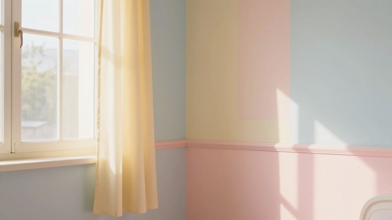
As the days start to stretch and the first hints of warmer weather appear, we find ourselves drawn to colors that mirror this gentle shift. Soft pastels are perfect for this time of year. They don’t shout; they whisper, creating a calm and inviting atmosphere in our homes. Think of the sky just before the sun fully rises, or the delicate petals of early spring flowers. These hues bring a sense of quiet optimism indoors.
Lavender, in its softer, muted tones, is a wonderful choice for creating a peaceful retreat. It’s not as bold as a deep purple, but it carries a similar sense of calm. We can use it in a bedroom for a truly restful feel, or even in a living area where we want to encourage relaxation. It pairs nicely with natural wood tones and crisp white trim. It’s a color that feels both sophisticated and comforting.
Blush pink is another fantastic option for that early spring vibe. It’s a warm, gentle color that feels like a soft embrace. It can make a space feel more welcoming and cheerful without being overwhelming. We’ve found it works well in entryways, making guests feel instantly at ease, or in a dining room to add a touch of subtle warmth to meals. It’s a color that really speaks to the hopeful feeling of spring.
When choosing pastels, consider the light in your room. Lighter shades can make a space feel bigger and brighter, especially on overcast spring days. We often look at how the color changes throughout the day, from the soft morning light to the dimmer afternoon sun.
As the days get longer and the sun starts to feel a bit warmer, we often find ourselves wanting to bring that same energy inside. It’s a natural shift, isn’t it? We’ve spent months in muted tones, and suddenly, we’re craving something a little more cheerful. This is where vibrant paint colors come into play, acting as a direct injection of spring’s optimism into our homes.
Think about the first daffodils pushing through the soil or the bright, clear sky after a spring shower. That’s the feeling we’re aiming for with sunny yellows. It’s not about a harsh, glaring yellow, but more of a soft, buttery shade that can make a room feel instantly more welcoming and cheerful. We’ve found that a pale, almost creamy yellow can work wonders in north-facing rooms that don’t get a lot of direct light. It bounces light around and makes the space feel much bigger and brighter. For a bolder statement, a slightly more saturated, but still warm, yellow can be fantastic in a kitchen or a breakfast nook. It really does feel like you’re eating your morning toast in a sunbeam.
If yellow feels a bit too bold, or you’re looking for something that feels more like a cool, refreshing breeze, then aqua and mint are your go-to shades. These colors are reminiscent of clear skies, fresh water, and new leaves. They have a way of making a space feel clean, calm, and revitalized. We’ve seen aqua used in bathrooms to create a spa-like feel, and it works beautifully. It’s calming without being boring. Mint green, on the other hand, brings a touch of nature indoors. It’s a gentle color that can make a living room feel more airy and open. It’s particularly effective in smaller spaces where you want to create a sense of spaciousness.
We find that these cooler tones are excellent for creating a sense of calm and order, which is often what we crave after the darker, cozier months of winter. They provide a clean backdrop that allows other spring decor elements to really pop.
So, as we look forward to longer days and that gentle spring light, we hope we’ve given you some good ideas for your walls. Picking the right paint color can really change how a room feels, especially when the sun starts to peek through more often. We’ve talked about a few shades that seem to catch that early spring brightness just right. Don’t be afraid to try something new; sometimes a fresh coat of paint is all it takes to make your home feel a bit more cheerful and ready for the season ahead. We’re excited to see how these colors might brighten up your own spaces.
To help our spaces feel more open and light as the days get longer, we often turn to colors that mimic the soft, gentle light of early spring. Think about colors like light lavender, gentle pinks, cheerful yellows, and cool blues or greens. These shades can really lift the mood and make any room feel more airy and welcoming, just in time for the warmer weather.
Pastel colors, like soft lavenders or light pinks, are fantastic for brightening a room because they are light and airy. They reflect more natural light, making the space feel bigger and more open. Using these gentle shades can create a calm and peaceful atmosphere, perfect for welcoming the fresh feeling of spring into our homes.
While pastels are wonderful for a soft glow, don’t shy away from brighter colors either! Sunny yellows can bring a burst of happiness, and shades of aqua or mint green can give your room a clean, refreshing feel, much like nature waking up. The key is to choose colors that bring you joy and reflect the vibrant energy of spring. We can use bright colors as accents or even for a whole wall to make a statement.

Leave a Comment