Licensed, Bonded & Insured
Palm Beach U-21244
Broward 09-P-15607-R


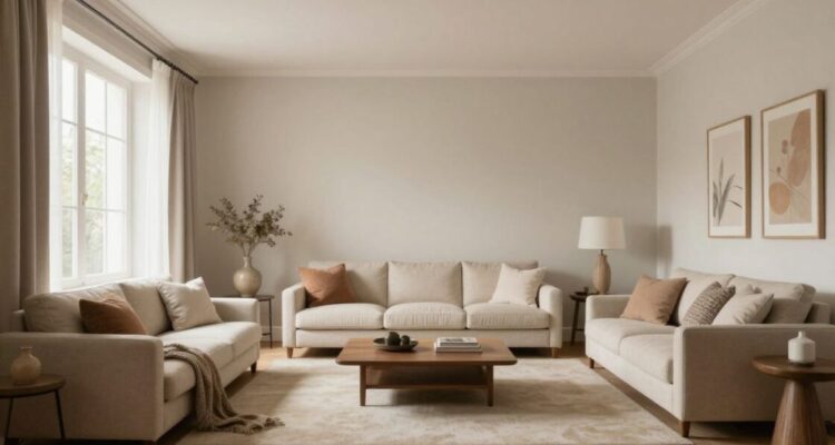
Choosing the right hues for your home is more than just an aesthetic decision; it is a way to shape your daily emotional landscape. Understanding these core concepts helps you create a home that feels perfectly tailored to your needs.
We believe that your home should be a reflection of how you wish to feel each day. The study of color psychology allows homeowners to curate environments that serve their specific lifestyle requirements and preferences. At Style Painting Corp, we have observed that understanding these patterns is an essential consideration for every homeowner we serve. By aligning paint choices with desired emotional outcomes, we help our clients create spaces that resonate with their personal vision of comfort and harmony.
Every color emits a frequency that the brain translates into distinct emotional reactions. While personal associations vary, universal patterns exist where certain shades are consistently linked with specific feelings like security, excitement, or calm.
Throughout history, humans have used local pigments to define the character of their shelters. These choices were often tied to available natural resources, which inherently linked specific hues to the concept of home and local identity.
Our eyes and brains are wired to prioritize certain colors because of our evolutionary past. This biological imperative means that even subconsciously, we react to saturation and brightness in ways that signal safety or danger to our nervous systems.
Spatial context dictates how color functions within a room. Factors like ceiling height, floor plan, and the presence of natural elements all change how a coat of paint behaves once it is dry on the walls.
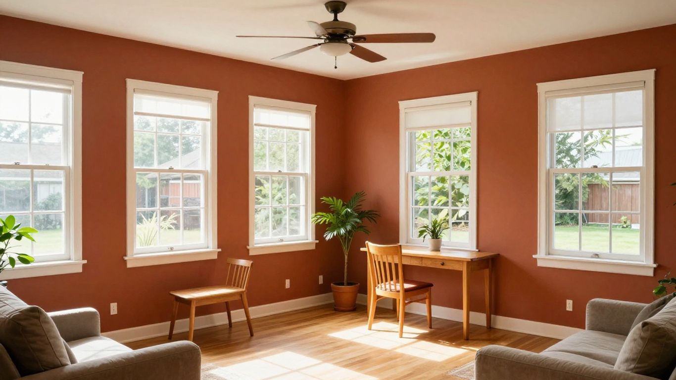
Inviting warm colors into your home can drastically change how a room feels during the evening hours. These shades act as visual stimulants that pull people closer together, fostering a sense of warmth and collective energy. Whether you are aiming for coziness in a den or vitality in a kitchen, these choices remain popular for their ability to soften hard edges.
Using deeper, earthy versions of red and orange can make expansive rooms feel much more grounded and cozy. Consider these applications for your home:
Applying these colors successfully requires a balance that keeps the space from feeling too active during rest times.
Yellow provides an instant lift to areas like hallways or breakfast nooks. It mimics sunlight, ensuring that spaces often lacking windows feel lighter and significantly more welcoming.
Rooms that receive little direct sun can often feel sterile and chilly. Introducing warm undertones helps reclaim the space, making it feel like a sun-drenched retreat regardless of the actual time of day.
Strong warm colors must be managed with care to ensure the environment remains livable. Overusing intense pigments can saturate the senses, so pairing them with muted accents ensures the room remains relaxing while still appearing vibrant.
Cool colors provide a necessary counterbalance to the stresses of our modern daily lives. By prioritizing blues, greens, and violets, you can effectively lower the visual temperature of your home. We find that when working on projects across Broward and Palm Beach counties, the team at Style Painting Corp ensures every surface is handled with precision to guarantee that these delicate transitions look flawless on every wall.
Blue is widely recognized as a color that slows the heart rate and encourages mental stillness. Incorporating softer blue shades can turn a chaotic room into a sanctuary, perfect for winding down.
Green sits at the center of the color spectrum and offers the most natural path to balance. Its ability to bridge the gap between interior decor and natural landscapes makes it an exceptionally versatile choice for modern homeowners.
| Green Tone | Primary Effect | Best Room Use |
|---|---|---|
| Sage | Calming | Primary Suite |
| Olive | Grounding | Living Room |
| Mint | Refreshing | Bathroom |
Selecting a green shade that complements your existing plants and art effectively creates a cohesive link to the natural world just outside your windows.
Lighter cool tones possess the optical property of receding away from the eye. This effect allows for the manipulation of spatial perception, effectively making smaller rooms appear more open and airy.
Focusing on desaturated cool tones ensures that your bedroom remains a restful place entirely focused on recovery. By limiting visual contrast in these spaces, we help you lower stimulation and prepare for deep rest.
Neutral foundations provide the ultimate flexibility for homeowners who want a base that grows with their changing tastes. They allow furniture and art to take center stage without competing with busy wall colors. We strive to transform your home environment with shades that offer timeless appeal rather than passing trends.
Grey and beige tones ground a home, providing a visual resting point that feels predictable and safe. This stability is crucial for busy households where noise, clutter, and activity can feel overwhelming.
White paint is the ultimate tool for amplifying the existing natural light in a property. It creates a clean, intentional envelope that makes a room feel larger and more organized.
Even neutral whites carry subtle hints of pink, blue, or yellow that dramatically impact how a room feels in the evening. Understanding these undertones determines whether a neutral space feels cozy or clinical.
Maintaining a consistent neutral palette across rooms creates a seamless flow in open floor plans. This cohesion prevents the eyes from feeling jolted as one moves between living, dining, and kitchen areas.
Color selection should always follow the intended function of the space rather than arbitrary design rules. A dining room meant for long evening conversations requires a completely different palette than a dedicated home office meant for high-focus tasks.
Cool tones that support concentration are ideal for office environments. We recommend soft grays or muted blues that keep the mind alert without being distracting.
Warm and inviting shades such as deep reds or rich browns encourage social interaction. These colors stimulate conversation and make guests feel comfortable sitting at your table for extended periods.
Master bedrooms function best when they are treated as restorative sanctuaries. Using soft, muted cool tones helps reduce anxiety, allowing you to disconnect from the day’s work completely.
Entryways set the tone for your entire home and see the most wear. We emphasize choosing durable coatings that retain their finish, paired with warm colors that welcome residents home.
Selecting the right shade is the most important step in the entire planning process. Our experts at Style Painting Corp often remind clients that professional results require careful thought regarding sheen, texture, and light exposure.
Colors appear drastically different from morning to evening. Testing your chosen pigment on the actual wall surface at different times will prevent disappointment after the final coat is applied.
Paint should always be tested near your largest furniture pieces to ensure the undertones do not clash. It is essential to confirm that your selected color brings out the best in the wood, fabric, and art you already own.
Sheen determines how light reflects off your walls, which in turn changes how deep or bright a color appears. Higher sheens tend to highlight imperfections, while flatter finishes provide a softer, more modern appearance.
Planning your color strategy with a professional ensures that you are considering factors like surface condition and lighting. This collaboration allows for a refined, high-quality outcome that you will be proud to live with for many years.
By carefully choosing your paint colors based on an understanding of human perception and room function, you can significantly enhance the quality of your home life. Applying these psychological principles transforms a simple paint job into a deliberate redesign that supports your wellbeing, providing a beautiful foundation for your daily experiences.
While lighter colors typically help a space feel more expansive due to higher light reflection, the type of light and the room’s orientation to the sun play an equally important role in how the space feels to occupants.
Warm colors are effective at creating an inviting atmosphere, but they are not the only choice; the goal is to create a balance that matches the specific type of social activity you expect to host most often.
It is best to observe samples for at least 24 to 48 hours to see how the color interacts with artificial interior lighting at night and natural daylight during the day.
Cool colors can feel clinical if they are very clean and bright; however, by selecting versions with warmer base undertones or applying them in rooms with soft lighting, you can maintain a sense of coziness.
Yes, the finish significantly alters the color appearance because it changes the level of light reflection, which can make colors appear either more vibrant or more muted as the light hits the texture.
While trends can be inspiring, it is better to look for colors that resonate with your personal style and local environment, as your home should remain a space you personally love for years.
Each room has unique environmental factors such as ceiling height, window placement, and the reflection of existing furniture, all of which alter how light interacts with the pigment once it is on the wall.

Leave a Comment